Spec project: Redesign Converse applying Gestalt
Discover how a Gestalt design transformation simplifies the user experience, eliminating decision fatigue and making choices effortless.


Back in 2023, I challenged myself to improve my UI/UX skills by applying Gestalt principles to interface design. These principles offer powerful tools for creating clear visual hierarchies and intuitive user experiences. To put theory into practice, I developed a spec project: redesigning the Converse website with a Gestalt-informed approach.
Now, with another year of experience, I analyze this work with new insights. Throughout this post, I'll share my thoughts on the original UI and UX of the Converse website, walk you through my redesign (2023), and conclude with improvement suggestions based on my current knowledge.
Table of Contents:
Goals of the spec project
Critically evaluate the existing Converse website
Redesign it based on my vision
Incorporate Gestalt principles into the redesign
1.1 Design critique of Converse’s Original website
I’ll start by highlighting the advantages and then address the limitations of the original website’s UI and UX.
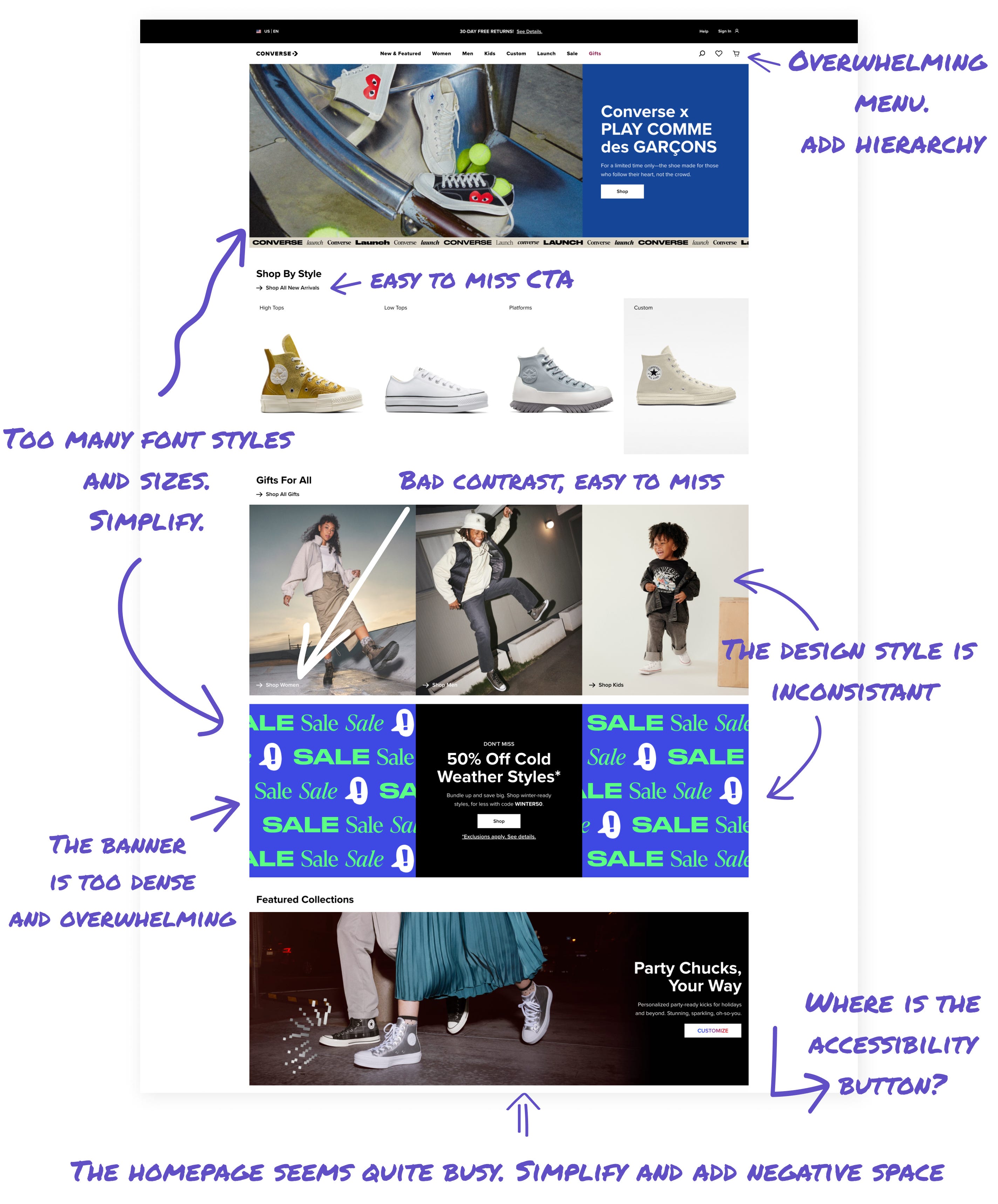
Critique: Visual hierarchy
Advantages:
A striking hero section boldly displays the text: "Converse x PLAY COMME des GARÇONS." This eye-catching element effectively highlights new or unique collaborations.
The "Shop By Style" section clearly categorizes shoes using consistent, visually appealing images for each style.
Areas for improvement:
The banners and promotions on the website lack a consistent visual style. The "SALE" banners, for instance, use different colors, fonts, and shapes compared to the "Gifts For All" and "Featured Collections" sections. This inconsistency disrupts the visual flow of the page and may create a distracting browsing experience for users.
The top menu has many options, and this is good for navigation but could be overwhelming for some users. Adding hierarchy or visual cues might help users locate specific areas without feeling lost.
Critique: Content organization
Advantages:
The website's grid layout is a key advantage. It offers a clean and organized appearance, helping users quickly find product categories and spot special offers. Each section follows a clear heading and provides a direct CTA.
Areas for improvement:
Using too many fonts and sizes can create confusion, so reducing the typography to match the brand's style guide will improve readability and strengthen brand consistency.
The homepage is densely packed with content, showcasing multiple products and promotions at once. This information overload may overwhelm first-time visitors, impacting user engagement and making navigation difficult.
Some CTAs, such as "Shop Kids," blend in with the background, reducing their visibility and effectiveness. Ensuring all CTAs stand out through contrasting colors, strategic placement, or distinctive design will improve click-through rates and overall conversion rates.
Critique: Visual harmony
Advantages:
The consistent color palette aligns with the Converse brand, using a monochromatic backdrop to highlight product images. Lifestyle and detailed product photos improve the website's visual appeal and boost customer engagement.
Areas for improvement:
The abundance of photos and visuals presented simultaneously may overwhelm users. Organizing the content more efficiently and improving spacing could improve the user experience.
1.2 Design critique
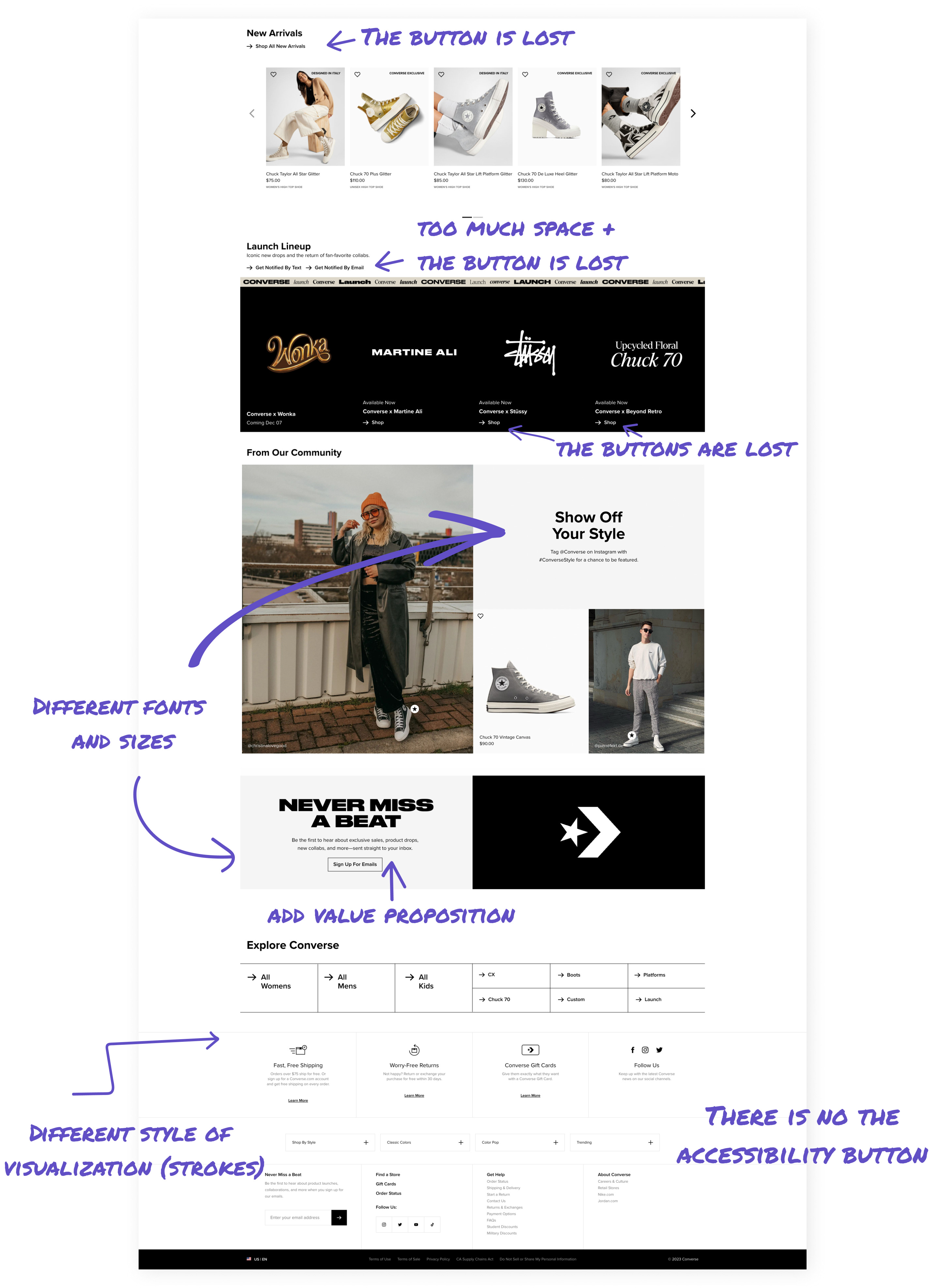
Critique: Content organization & Layout
Advantages:
The "New Arrivals" section allows users to easily browse the latest products using an interactive carousel.
The "Notify Me" button in the "Launch Lineup" section effectively drives user engagement by allowing customers to receive alerts about upcoming product releases.
The strategically placed and user-friendly email signup form under “NEVER MISS A BEAT” illustrates how clear and consistent CTAs can improve conversions.
Areas for improvement:
The "Shop All New Arrivals" link is difficult to notice because of its small size and poor positioning.
The notification signup options (text and email) in the "Launch Lineup" section take up excessive space and blend into the banner background.
Critique: Visual elements & Branding
Advantages:
The imagery aligns well with the brand's aesthetic and lifestyle focus.
The color scheme consistently reflects the brand's identity.
The footer provides comprehensive information, benefiting both SEO and user navigation.
Areas for improvement:
The “NEVER MISS A BEAT” section's inconsistent text sizes and abrupt background color change disrupt the visual flow.
The email signup section lacks a compelling value proposition to encourage user engagement.
Optimizing the footer's layout would improve readability and encourage smoother user navigation.
2.1 Converse redesign: My version
I redesigned the Converse homepage, applying key Gestalt principles and addressing previous design critiques. The new layout features and content organization improved navigation, clearer product categorization, and a stronger visual hierarchy, improving both brand identity and user experience.
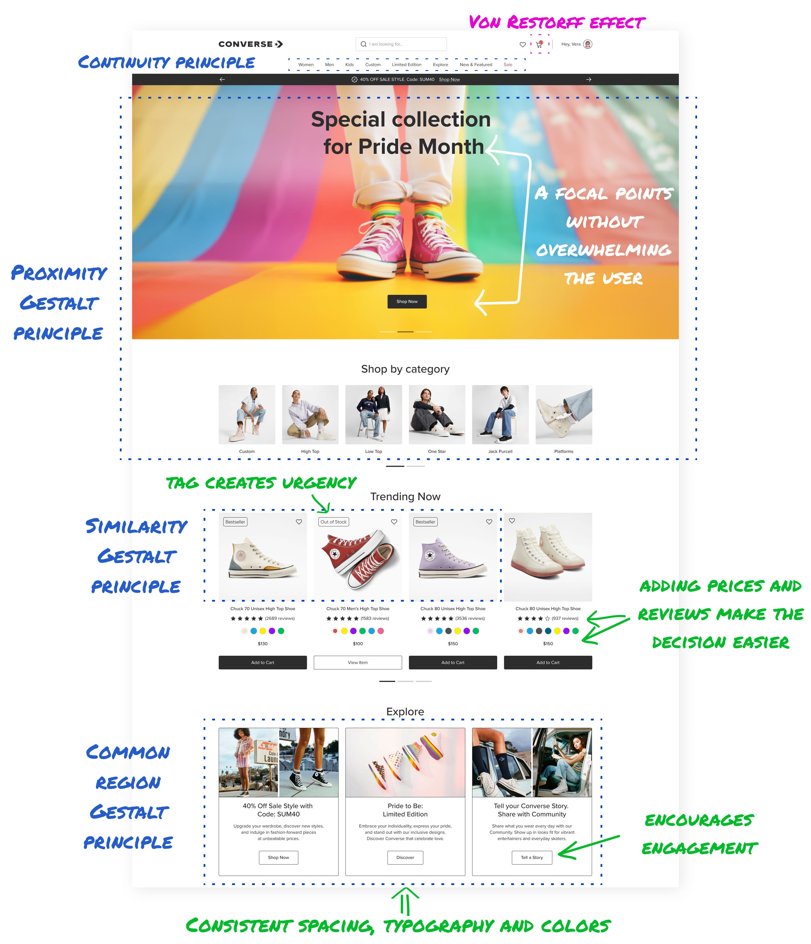
Redesign: Visual hierarchy
I created a “Special Collection for Pride Month” banner on a slider, creating a strong visual anchor without overwhelming the layout. The banner serves as both a focal point and a clear call-to-action. This design choice aims to improve user engagement, draw attention to the Pride Month collection, and highlight the brand’s support for the LGBTQ+ community.
I created various sections to offer an organized browsing experience, including “Shop by Category,” “Trending Now,” “Explore,” and “Arriving Soon.” These sections help users navigate the site more efficiently and discover products of interest, enhancing their overall shopping experience.
To maintain brand consistency, I applied a consistent design approach, incorporating spacing, typography, and a color palette that aligns with Converse's established brand identity.
Redesign: UI-elements
I created distinct product sections like “Trending Now” and “Arriving Soon.” Each product displays clear prices and ratings, streamlining the user's decision-making process. This user-friendly design helps customers quickly find and evaluate items of interest.
I implemented various urgency indicators on cards, such as “Out of Stock,” ”Limited,” and “Bestseller.” These labels aim to create a sense of urgency and encourage quicker purchasing decisions."
The 'Explore' section is designed to actively engage users with the brand by offering diverse interactive elements. Users can discover new products, participate in community events, and share their experiences. Featuring user stories prominently boosts engagement and fosters a sense of community.
2.2 Converse redesign: My version
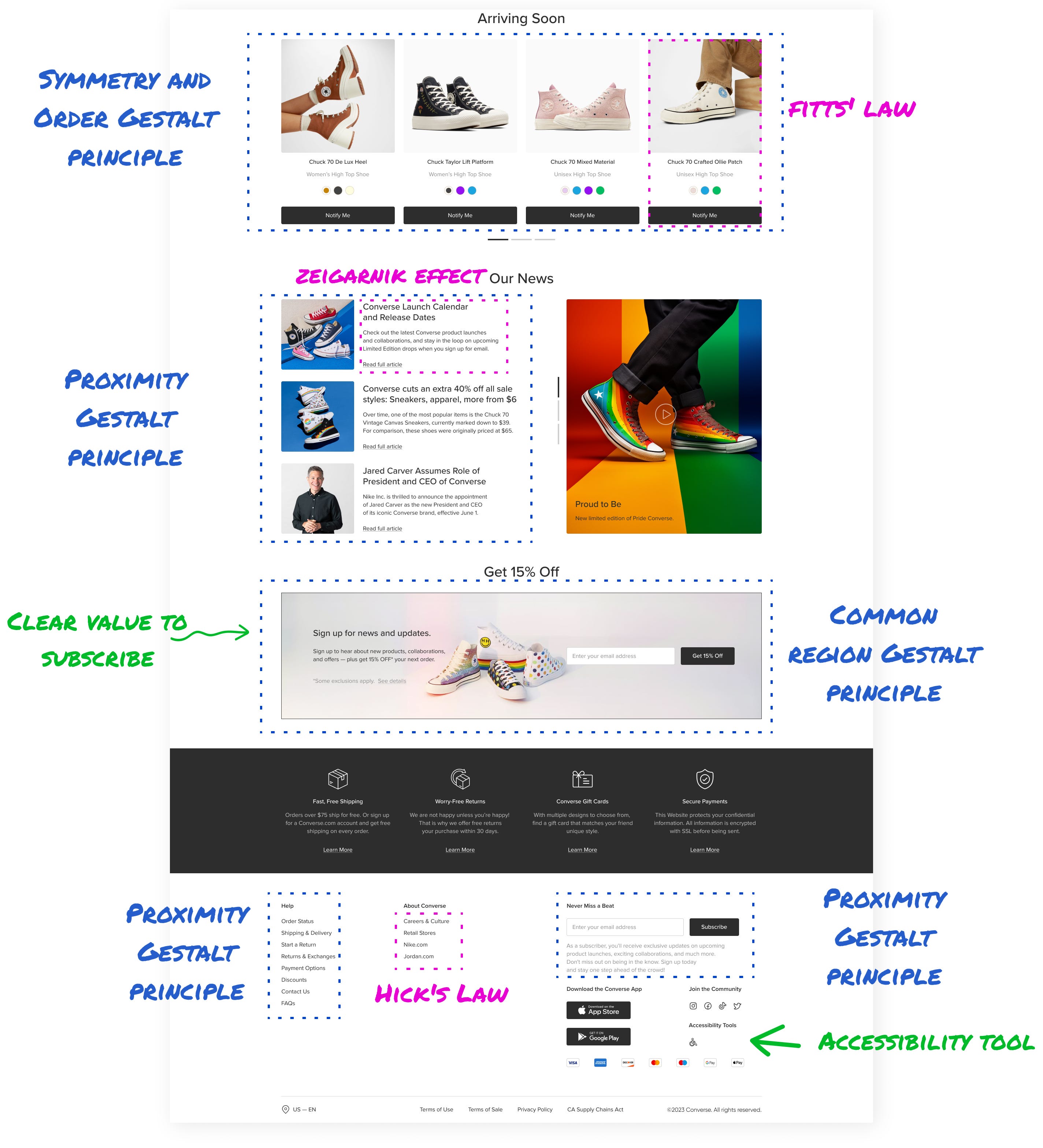
Redesign: User’s engagement
I placed the email signup offer for a 15% discount above the footer to clearly encourage users to subscribe without disrupting the user’s flow.
Redesign: Footer functionality
I simplified the footer by reducing visual clutter and grouping links into clear categories, offering an easier navigation path without overwhelming users.
To build trust with the Converse community, I highlighted key features such as free shipping, easy returns, and secure payments using eye-catching icons on a contrasting background.
I added an accessibility button, making the site more inclusive for users with different needs.
3. More redesigned pages


Explaining Gestalt principles
Here's how I implemented key principles, prioritized by their impact on the design:
Proximity and Common Region
Grouped related items, such as individual product types, within outlined areas or similar background colors.
Impact: Users can quickly identify similar items, leading to faster decision-making and improved navigation.
Continuity and Connectedness
Created a smooth flow between sections, guiding users naturally through content.
Established clear relationships between elements in the checkout process.
Impact: Users experience a more intuitive and logical journey through the site.
Similarity
Used consistent fonts, colors, and shapes for UI elements with similar functions. Example: Applied the same button style for all "Add to Cart" actions across product pages.
Impact: Users can easily recognize and understand the purpose of different interface elements.
Von Restorff Effect
Helped the Cart icon stand out using vibrant colors.
Impact: Increased visibility prompts users to take action, potentially improving conversion rates.
Fitts' Law
CTA buttons were placed close to relevant items, reducing cursor travel time. For example, the "Buy Now" button was positioned directly under product images.
Impact: Quicker interactions lead to a more efficient user experience.
Zeigarnik Effect
Implemented a progress bar in the checkout process.
Impact: Leverages users' tendency to remember uncompleted tasks, encouraging them to finish their purchase.
Symmetry and Order
Created symmetrical balance in tiled layouts and product displays. Impact: A structured and harmonious look that's visually attractive and easy to navigate.
Hick's and Miller's Law
Minimized complexity by streamlining options in menus and product filters.
Consideration: Recognized that users typically keep 7±2 items in their working memory.
Impact: Reduced cognitive load, making decision-making easier for users.
What I would improve in my redesign
Reflecting on my 2023 Converse page redesign, I've since identified key areas for improvement in accessibility and UX.
One major issue is the Accessibility icon's placement in the footer. Positioning it at the top of the page would significantly improve visibility and demonstrate the brand's commitment to inclusivity.
The “Special Collection for Pride Month” banner I added, although visually appealing, suffers from poor readability due to low text-background contrast, which affects users with visual impairments.
Moving forward, I would approach redesigns with a more holistic view, considering accessibility and community building as fundamental aspects. If this wasn’t a spec project, I would also conduct user research on my prototype across diverse groups, including those with ADHD and dyslexia, to ensure the design serves all users.
A combination of design, AI, psychology, and neuroscience creates a magical and impactful user experience for products.